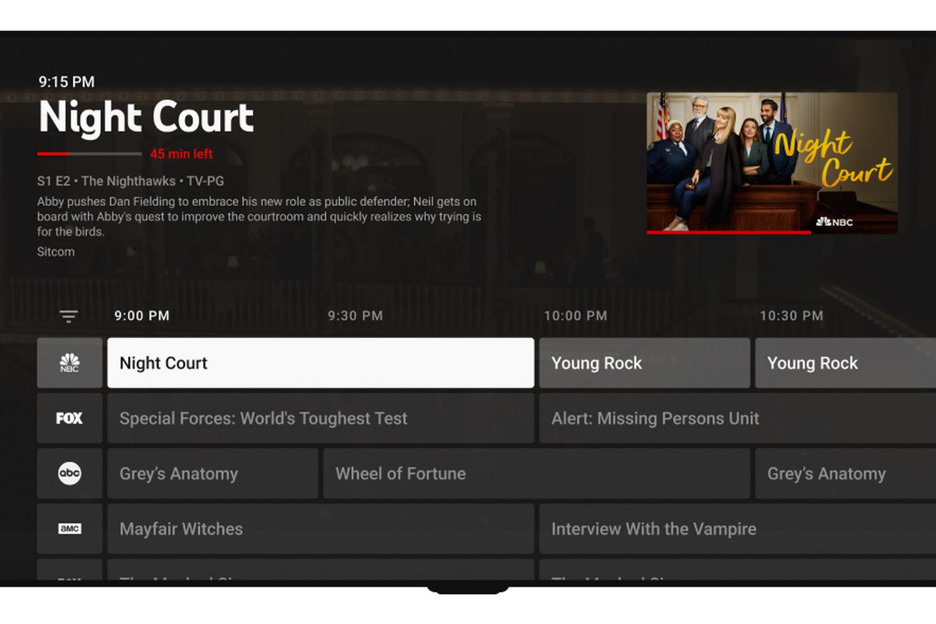
 The refreshed live TV guide has a condensed grid and now shows episode descriptions. | Image: YouTube
YouTube TV subscribers will notice some refinements and tweaks to the service’s “library” section starting today. The new interface lets viewers see more programming and recommendations at once and includes simplified filters for drilling down into the type of shows you actually want to find. It’s not a wholesale reinvention of the TV guide — but so far, it looks like a quicker way of finding something to watch.
“This UI model is almost like the hybrid, I would say, of a grid and a feed. We’re continually thinking about how to...


