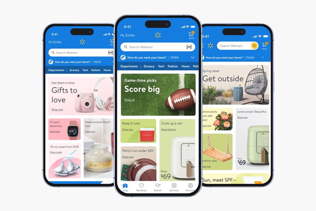
 Image: Walmart
Walmart’s website and app have a new look, and I have to admit that it looks a lot cleaner than Amazon’s. The retail giant swapped out a more cluttered interface for one with bubbly blocks displaying various departments and deals across the store.
When you scroll down on the homepage, you’ll see even more shopping categories, along with specific ...


